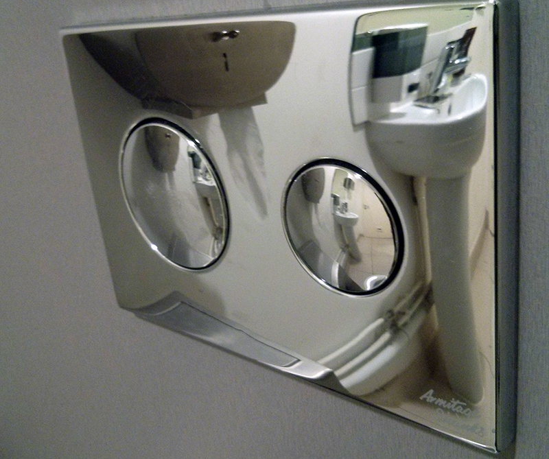
I’ve got something of a fixation with plumbing interfaces.
Growing up I became fairly accustomed to the standard arrangement of hot/cold shower and bath taps, or in the case of the 2nd bathroom at Mum & Dad’s place, an extra knob to open the channel to the shower head or from the tap spout. Intuitive, sensible, logical.
Moving to the UK I was exposed to a variety of other possibilities, and then upon my various travels around Europe I’ve often considered putting together a photographic essay on different ways people have to control the flow of warm water – and generally it’s pretty easy to figure out what’s going on.
But there’s another plumbing interface which has confused me for a while, and it turns out to be not so obvious.
My first recollection of a dual-flush cistern featured a control surface that looked something like this:
 Fairly straightforward stuff, nothing complex there. The visual indicators on the buttons tell you pretty much exactly what’s going on.
Where it gets more complex – as I learned during a quick straw poll last night – is setups like this:

I showed this picture to the other people I was having dinner with, and they all looked at me oddly. Unanimously their faces (and for the most part, voices) said “What part of this isn’t completely obvious?!”. And then proceeded to all contradict each other.
The permutations as I see it are:
- The size of the button correlates to the volume of the flush, so the smaller button represents the half-flush / water saving option.
- The button is sized proportionally to how often it’s likely to be used. So generally as reducing water use is seen to be popular/desireable, so the half-flush would get a much larger button and provide the user more opportunity to select that option – with a smaller button available for the rarer instances where full-flush is required.
Option 2 sounds a bit like overthinking, however it’s borne out in practice by interfaces such as this:

Customarily in this case pushing the smaller button will take the larger button down with it, thus representing the full flush even better. So safe in this knowledge, we’re suddenly presented with this:

And what this is supposed to mean is anyone’s frigging guess.

And then there’s whatever happens in Japan.
Maybe it’s just different in Australia because water’s scarcer than platinum, so there’s an ingrained cultural bias towards using less of it wherever the opportunity arises.
So, does anyone have a canonical answer?
There is a third possibility which occurred to me this afternoon –
- The flushes bear no resemblence to the size of the button and are purely based on how the installer felt like rigging them up.


